There is a saying where we come from “ para el gusto hicieron los colores.” It translates, “for the taste, colors were made.” Colors are everywhere! Can you imagine a world in black and white? Sure, that’s OK for those filters for your pictures, but in real life we need color.

Everybody has their own taste and thank goodness for the variety in colors we have. Color is so important we even use it to describe our moods. They can affect our state of mind making us feel happy, more creative, calm or passionate. Cue the nineties mood ring!
That’s where color psychology comes in! It helps us use colors to our advantage and has been used for many years to do just that. Why do you think food companies use a lot of red and yellow? Hint* they trigger hunger in our brains. Some businesses, like banks, use blue and green which translates feelings of calmness and confidence.
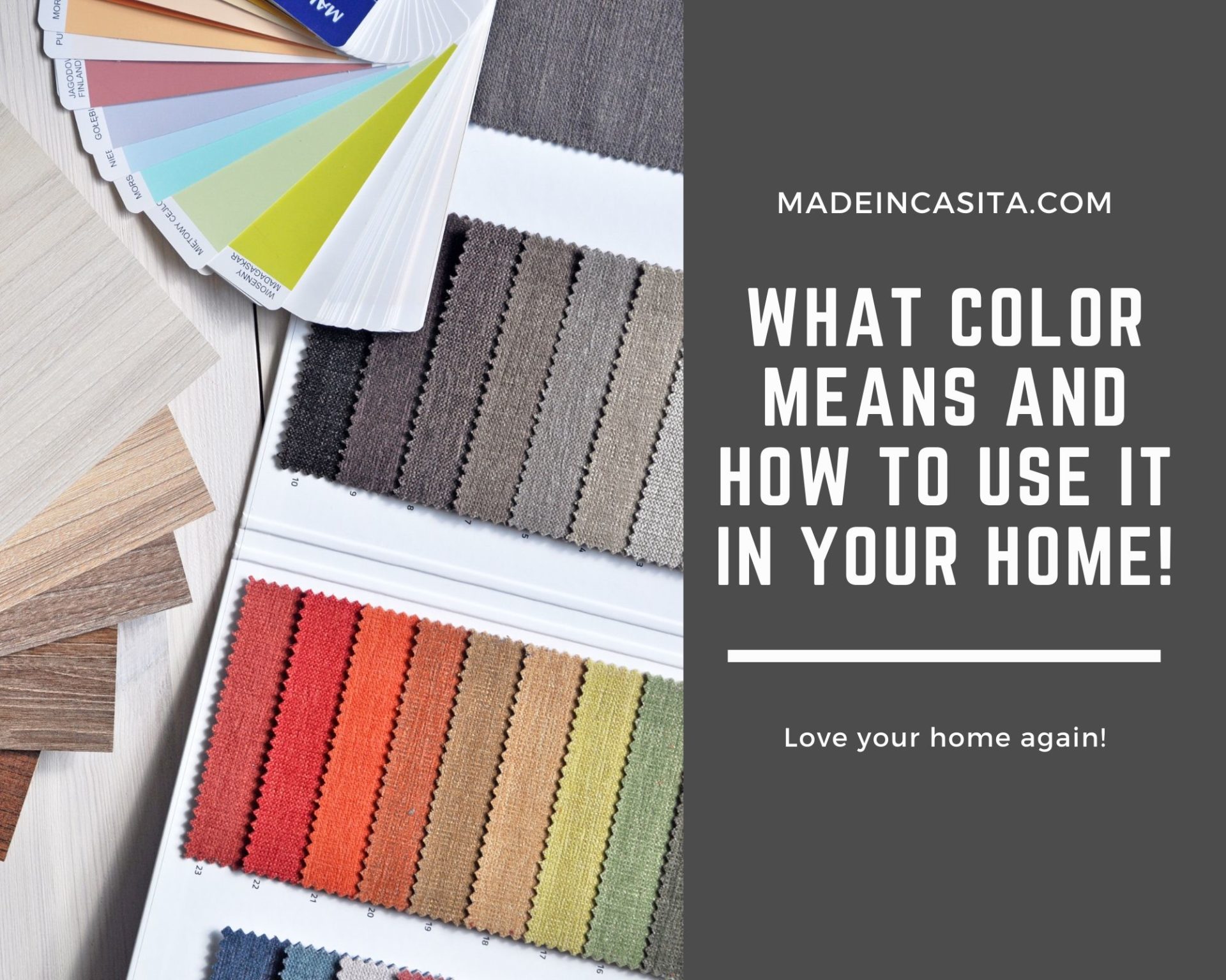
A drag office stagnating your creativity? Bedroom not quite as calming as you’d like? Knowing what color means and how to use it with a goal in mind just might help! Take a look at some of these sample color combinations that just may help cure your ache!
Here are the meanings of each color and ideas on how to use them!
Black
A very strong color! It is synonymous of elegance, boldness and sophistication. It can be very overpowering so try to use with discretion because once you go black you never go back, at least not without a bad-ass primer.

Grey
This is a versatile color. It’s conservative, classic and reserved. Due to its neutral tone it can go practically anywhere. Think dining room, office (like we did), bathroom and bedrooms. No wonder there’s 50 shades of gray 😉

Blue
In a darker the tone, you can achieve either confidence, stability and security. In lighter shades blue inspires serenity, calmness and a cool vibe.

Green
The color of nature! It can mean hope, freshness, naturalism.

Yellow
Think positive, warmth, happiness, like the sun. It promotes creativity, energy and in a golden hue resembles richness.

Orange
It’s a derivative of yellow so it will interpret energy and optimism.

Brown
Such a grounded tone (no pun intended)! It represents earthiness, warmth, rustic and natural vibes.

Red
This color can conjure feelings of passion, sexiness, strength, vitality and hunger (😉). Seriously hunger, think of fast food joints like McDonald’s and Wendy’s (red anyone). In a darker tinge, red can be refining and aggressive.

Pink
Not only for women although usually represents femininity. It’s well known for romance and innocence in a light tint. Think of the walls and furniture in a nursery. In a more vibrant shade like fuchsia or hot pink it incites playfulness and excitement.

Purple
It’s a very erudite color exemplifies sophistication, spirituality, royalty, creativity, mystery, and royalty. Although in a lighter hue can convey nostalgia.

White
The color of purity. White works great with all other colors. Very modern and minimalist and can adjust well to anything. The saint of colors if you may.

Now that you know what color means and how to use it, go and use some color psych to add more zen to your home! Speaking of psychology, tell us, how do you feel? What colors will you try next? Comment and share the inspiration below!
Sources: The items in this post can be found online at Target, Amazon, Grandin Road, All Modern, Athome, The Container Store, Hobby Lobby and Wayfair. We will not be compensated for any purchases you make.